Beautiful Forms Convert Better: Why Form Design Matters
Capture better leads
Build a form that qualifies the next step
Create a lead form or recommendation quiz that asks the right questions and routes every response.
Most forms lose people before the first field is filled.
Not because the question is impossible. Not because the visitor suddenly stopped caring. Because the form looks like an afterthought: plain layout, mismatched colors, a generic header, and a submit button that feels like paperwork.
That matters more than teams admit. A form is often the first moment someone stops browsing and starts trusting you with information. For a signup, contact, lead generation, booking, registration, or intake flow, the form is not a back-office utility. It is the conversion surface.
Typeform proved that forms can be beautiful. Its one-question-at-a-time experience changed expectations for what a form could feel like. But not every form should be a card flow. For registrations, contact forms, lead gen forms, quote requests, and event signups, each extra “next” click can become another chance to leave.
The better answer is not “make every form Typeform-style.” The better answer is this: classic one-page forms should be beautiful too.
TL;DR - Beautiful forms convert better when they make the respondent feel confident, oriented, and willing to finish.
- Design is a trust signal - a polished form makes the organization behind it feel more credible.
- Classic forms still matter - one-page layouts reduce steps for signup, contact, lead gen, and registration flows.
- Visual coherence lowers friction - the header image, colors, typography, and button should feel like one system.
- Works for: event registration, contact forms, waitlists, quote requests, workshop signup, client intake, and lead capture.
- FormHug makes classic forms look designed by combining built-in themes, header images, and automatic style adaptation.
Try the Live Example Form
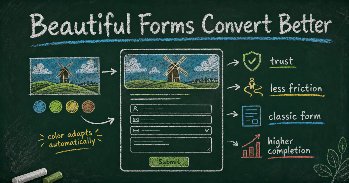
The fastest way to understand the point is to feel it. This example uses a classic one-page layout, but the header image, background color, button color, and selected state all work together so the form feels intentional instead of generic.
Open the beautiful form example in a new tab ->
What Is a Beautiful Form?
A beautiful form is not just a form with a nice picture at the top.
It is a form where the visual choices make the task feel easier. The title feels clear. The header image matches the purpose. The color palette feels intentional. The spacing makes the form scannable. The button looks like the obvious next action. The whole page gives the respondent a quiet sense that someone cared enough to make this experience worth finishing.
That last part is important. People do not usually describe a form as “trustworthy because the border radius was good.” They just feel it. A modern form makes the organization feel modern. A dated form makes the process feel dated. A rushed form makes the request feel less important.
For customer-facing forms, beauty is practical. It helps answer three silent questions:
| Respondent question | What good design communicates |
|---|---|
| ”Am I in the right place?” | The header image and title match the context. |
| ”Is this safe to fill out?” | The page looks official, polished, and cared for. |
| ”Will this take too long?” | The layout is easy to scan and the next action is obvious. |
The point is not decoration. The point is confidence.
Why Beautiful Forms Improve Completion Rate
Completion rate is usually discussed as a field-count problem: ask fewer questions, shorten the form, make the CTA clearer. All of that is true. But it misses something earlier.
Before someone decides whether a form is too long, they decide whether it is worth starting.
A beautiful form improves completion rate because it reduces hesitation at the start. It tells the respondent that this is a real experience, from a real team, for a real purpose. That matters most in moments where the user has a choice: sign up for an event, request a quote, join a waitlist, contact a company, or submit personal details.
There are four conversion effects hiding inside good form design.
1. It creates trust before the first answer
People judge digital experiences quickly. If the form looks generic, old, or broken on mobile, the respondent may not think “bad visual design.” They may think “is this link legitimate?”
That is especially true for forms asking for email, phone number, company details, budget, health information, student information, payment intent, or anything connected to identity. A plain form can still work internally, but a public form has to earn the right to collect information.
2. It makes the task feel lighter
Good typography, spacing, and hierarchy make a form feel shorter even when the field count is the same. Related fields are grouped. Labels are readable. Required fields are clear. The submit button is visible and specific.
The user still has to answer the questions. But the page feels less like administrative work.
3. It matches the user’s emotional context
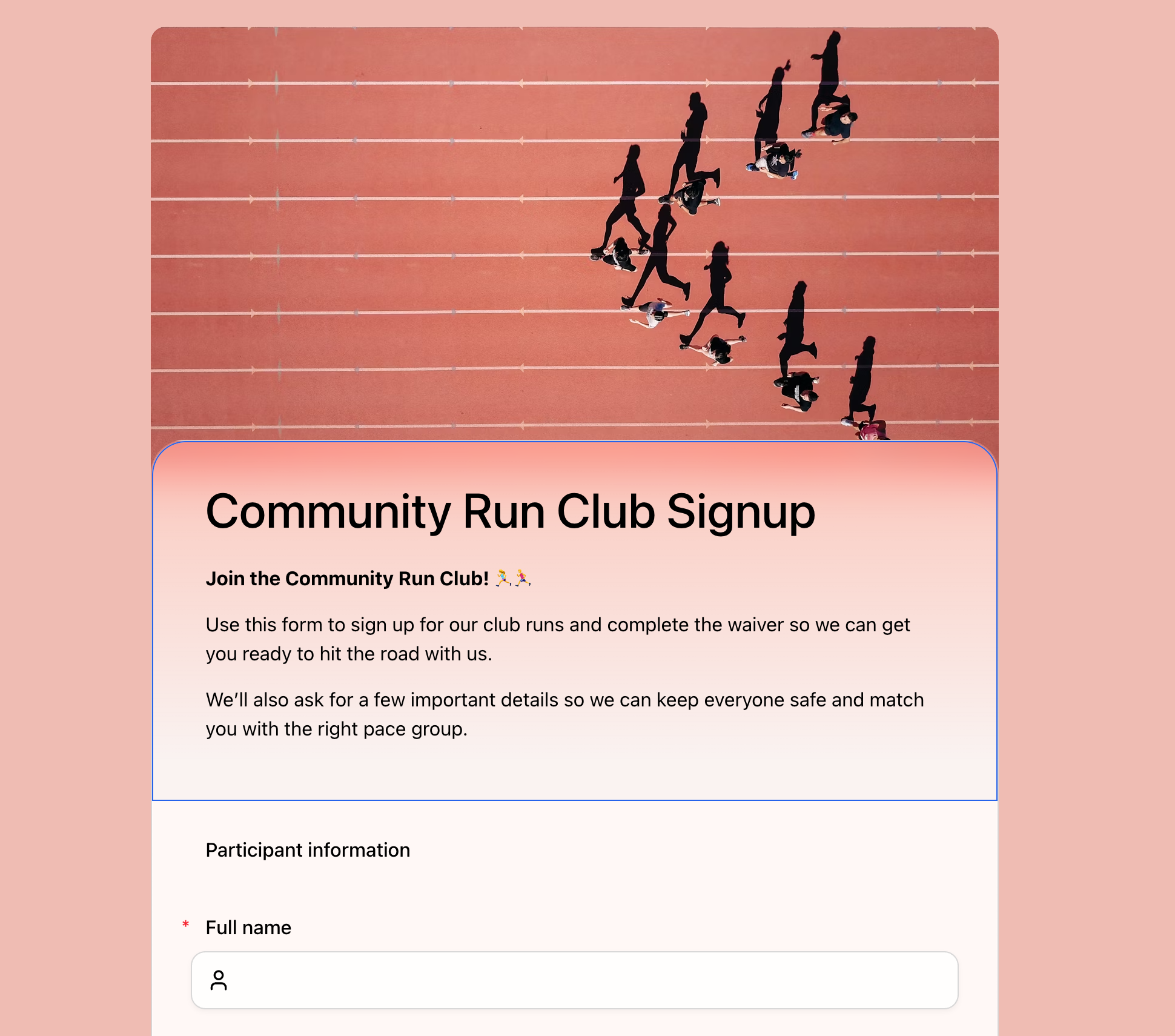
A community run club signup should not feel like a tax form. A wedding RSVP should not feel like an IT request. A customer feedback survey should not look like a forgotten spreadsheet interface.
The visual mood should match the promise of the form. Warm for events. Clear for business intake. Friendly for feedback. Serious for applications. This is where a header image and color system do more than “look nice.” They set expectations.
4. It keeps momentum in one-page workflows
For many high-intent forms, the classic layout is still the better conversion pattern.
In a registration form, the respondent often wants to see the whole ask before they begin. In a contact or lead generation form, they want the fastest path to “send.” In a quote request, they may need to review details before submitting. A one-question-at-a-time flow can feel polished, but every screen transition adds a small decision point.
Classic forms reduce the number of decisions. A beautiful classic form keeps that efficiency without looking plain.
 Classic layout is often the right fit for registration. Respondents can scan the form, understand what is required, and move through the fields without extra screens.
Typeform Is Beautiful, But Card Flow Is Not Always Right
Typeform deserves credit. It showed the industry that forms did not have to look like database inputs. The one-question-at-a-time format is memorable, focused, and often great for conversational surveys, personality quizzes, brand research, and flows where the experience itself is part of the story.
But form design is not a beauty contest between one format and another. It is a fit problem.
Card flow works best when focus matters more than scanning. Classic flow works best when speed, review, and context matter more than drama.
| Use case | Better default | Why |
|---|---|---|
| Event registration | Classic | People want to see details, requirements, and contact fields together. |
| Contact forms | Classic | The shortest path to send usually wins. |
| Lead generation | Classic | Every extra screen can become another drop-off point. |
| Quote requests | Classic | Respondents often review scope details before submitting. |
| Personality quizzes | Card | One question at a time can feel more playful and focused. |
| Brand surveys | Card or classic | Depends on length, audience, and campaign context. |
This is why FormHug supports both. Card layout is there when the form should feel conversational. Classic layout is there when the form should feel efficient. The important part is that classic does not have to mean plain.
Google Forms Made Classic Familiar, But Also Generic
Google Forms made online forms accessible. It is free, familiar, and good enough for many internal workflows. But its visual language is unmistakable. Even with a custom header image, a Google Form still looks like a Google Form.
That can be fine for a classroom poll or an internal lunch order. It becomes limiting when the form represents a public-facing experience: a workshop signup, a customer inquiry, a creator waitlist, a hiring intake, a paid event, or a client onboarding flow.
The issue is not that Google Forms is ugly in a dramatic way. It is that it is generic. Generic design creates generic confidence. The respondent does not feel a strong connection between the form and the organization that sent it.
If your form is part of your brand, campaign, event, or sales process, the visual system should belong to you.
How FormHug Makes Beautiful Classic Forms
FormHug’s design point of view is simple: the form should look considered before you manually design anything.
That starts with a polished default aesthetic. Forms use a frosted, modern visual style with enough depth to feel premium and enough restraint to stay readable. But the bigger difference is what happens when the header image changes.
In FormHug, the header image is not just a banner sitting above a plain page. You can choose from built-in image recommendations, search Unsplash, generate or upload your own image, and the form can adapt its visual tone around that choice. The palette, mood, and surrounding colors shift so the full page feels like one designed object.
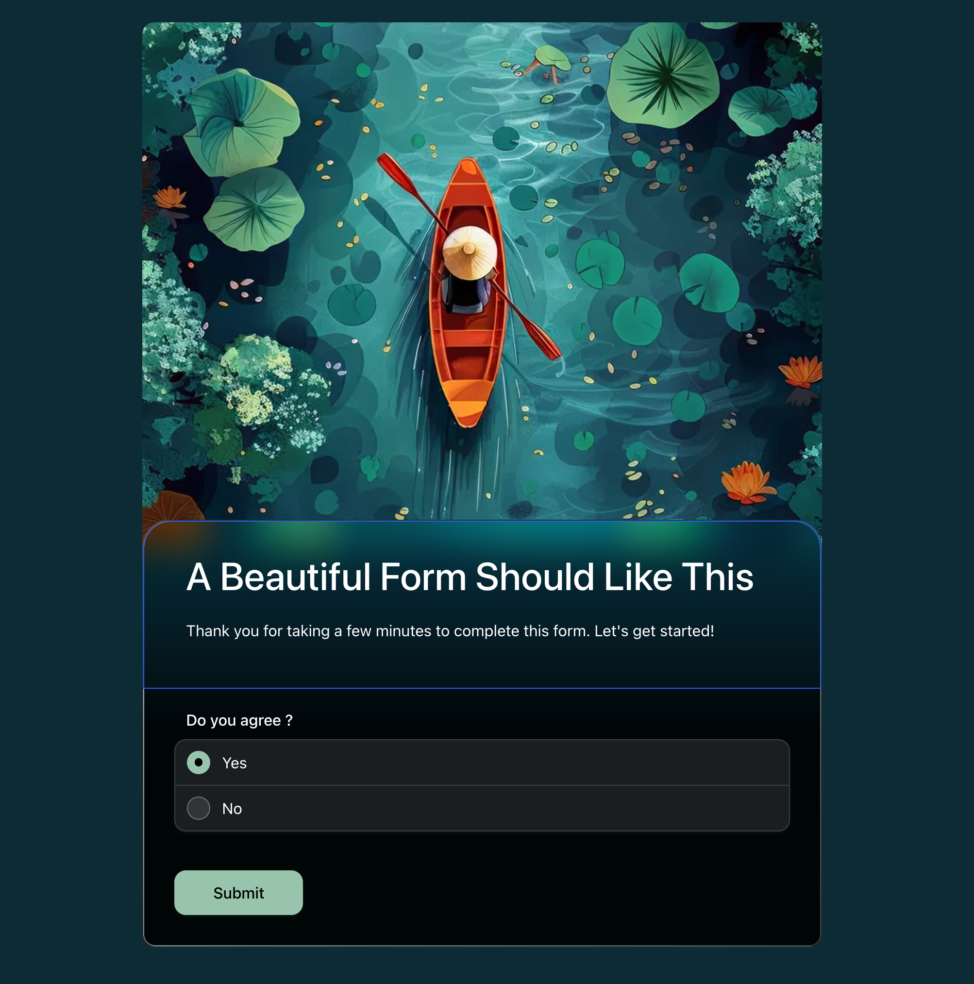
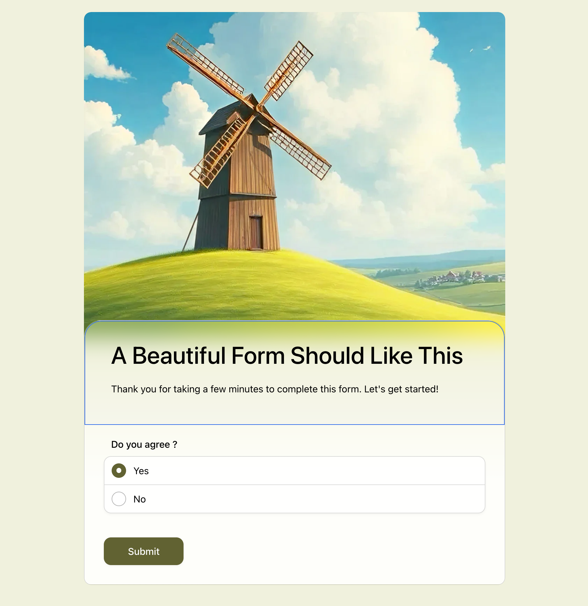 A classic one-page form can still feel designed. The header image, soft background, button color, and selected answer state all belong to the same visual system.
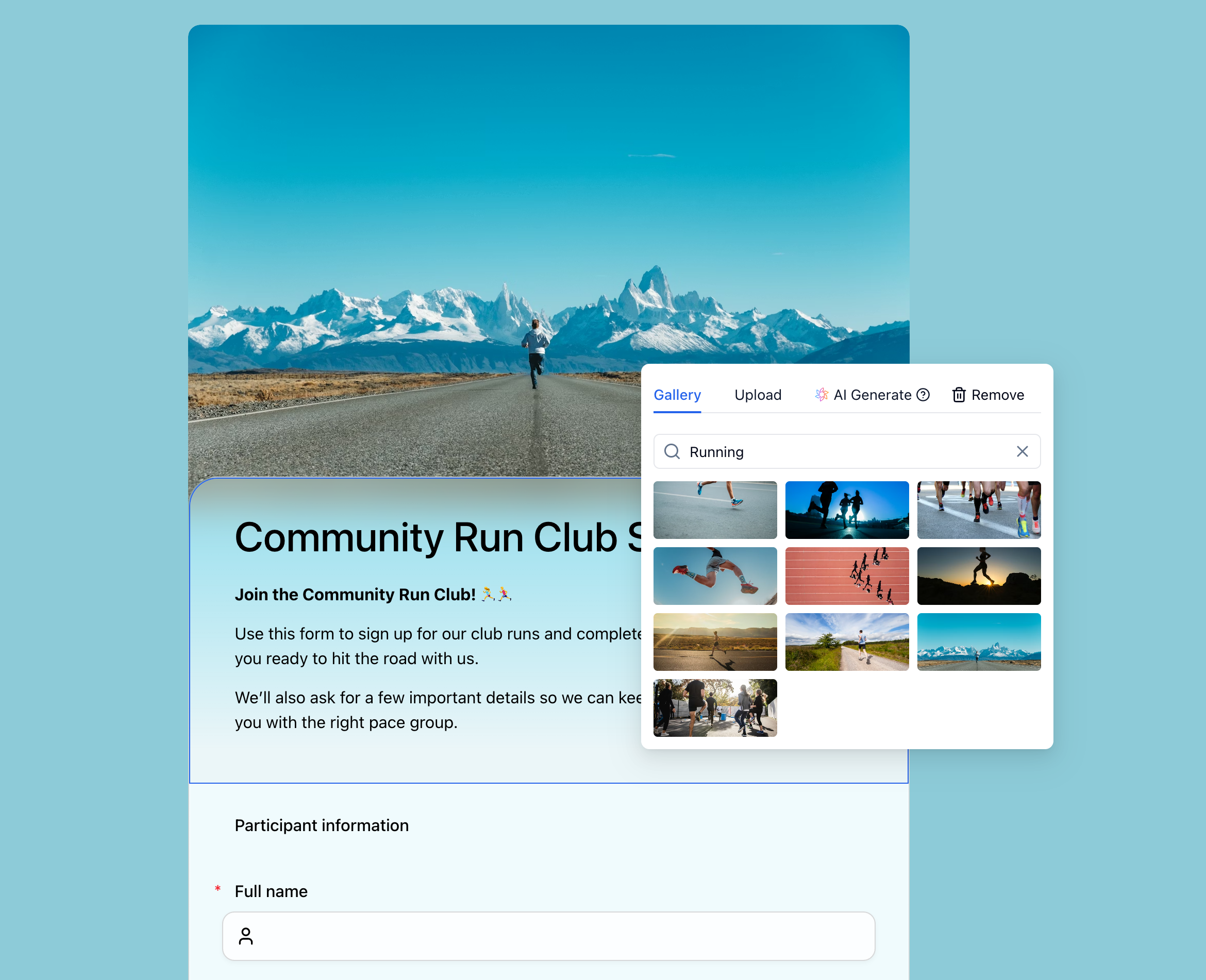 The image picker is part of the styling workflow, not a separate decoration step. Search, upload, or generate a header image, then let the form adapt around it.
 When the header changes, the form does not stay visually generic. The surrounding colors, button, and selected state adapt around the new mood.
That means a community run club form can feel warm and energetic. A workshop registration form can feel editorial and thoughtful. A client intake form can feel calm and professional. A feedback form can feel light and approachable.
The respondent does not need to know that a color system is being calculated from the image. They just see a form that looks like it belongs together.
How to Build a Beautiful Classic Form
You do not need to become a designer to make a classic form feel designed.
In the FormHug editor, start with the form you already have, then change the header image. Search Unsplash for something that matches the use case, generate an image with AI, or upload a photo from your own brand or event. That single choice gives the form a visual direction.
From there, FormHug adapts the surrounding style so the page feels cohesive: background, button, selected state, and overall mood all follow the header instead of sitting underneath it as a generic form. Keep the questions clear, keep the classic one-page layout scannable, and let the image do the visual work.
When Beauty Matters Most
Not every form needs a cinematic header and custom mood. Internal admin forms can stay plain if speed is the only goal.
Beauty matters most when the form is public, voluntary, and tied to trust. That includes:
- Lead generation forms where the visitor can still decide not to talk to you.
- Contact forms where the respondent is choosing whether your team feels responsive.
- Registration forms where the form has to make the event feel organized.
- Client intake forms where people are sharing personal or business context.
- Waitlists and early access forms where the form is part of the product’s first impression.
- Surveys and feedback forms where visual care can make the request feel worth answering.
The more choice the respondent has, the more the form’s first impression matters.
Frequently Asked Questions
Do beautiful forms really get more submissions?
Beautiful forms can improve submissions when the design reduces doubt, clarifies the task, and makes the experience feel trustworthy. Design alone cannot fix a confusing offer or an overly long form, but it can help more people start and finish a form they were already considering.
Should every form use a one-question-at-a-time layout?
No. One-question-at-a-time layouts are useful for conversational surveys, quizzes, and branded experiences where focus matters. Classic one-page layouts are often better for registration, contact, lead generation, intake, and quote request forms because respondents can scan the whole form and submit with fewer steps.
Why do classic forms sometimes convert better?
Classic forms remove repeated “next” clicks. For high-intent tasks, every extra step is another chance for someone to reconsider, get distracted, or decide the form is longer than expected. A well-designed classic form keeps the path visible and efficient.
What makes Google Forms feel generic?
Google Forms has a familiar fixed layout, limited theme controls, and a visual style that is easy to recognize. That makes it useful for quick internal forms, but harder for public-facing forms that need to feel branded, premium, or tied to a specific event or campaign.
How does FormHug make forms look better?
FormHug combines a polished default design system, built-in themes, header image selection, Unsplash search, uploads, and automatic style adaptation. When the header image changes, the surrounding form colors and mood can adapt so the whole form feels more cohesive.
Can I still use FormHug for simple forms?
Yes. A beautiful form does not have to be complicated. You can keep the form short, use a classic layout, choose one strong header image, and publish a clean form for contact requests, signups, RSVPs, feedback, or lead capture.
What is the best layout for a lead generation form?
For most lead generation forms, a classic one-page layout is the safer default. Ask for the minimum information needed to continue the conversation, keep the visual design polished, and make the CTA specific. Card layout can work for quiz-style funnels, but direct inquiry forms usually benefit from fewer steps.
Related
- How to Build a Lead Generation Form That People Actually Complete - reduce friction at the final conversion point.
- How to Add a Header Image to a Google Form - understand why the header image is more than decoration.
- FormHug vs Typeform (2026): The Best Free Typeform Alternative - compare card-only forms with FormHug’s classic and card layouts.
- FormHug vs Google Forms (2026): The Best Free Google Forms Alternative - see how FormHug compares with the default free form tool.
A form is often the last few seconds between interest and action. If that moment looks generic, people hesitate; if it looks intentional, they are more likely to finish. Create a beautiful form ->

Written by
FormHug TeamProduct, research, and form automation team
The FormHug Team brings together product builders, workflow researchers, and form automation practitioners who study how people collect, route, and act on information online. Our guides are based on hands-on product testing, template analysis, customer workflow patterns, and deep experience with forms, surveys, quizzes, AI-assisted creation, integrations, and results sharing.