How to Build a Lead Generation Form That People Actually Complete
Capture better leads
Build a form that qualifies the next step
Create a lead form or recommendation quiz that asks the right questions and routes every response.
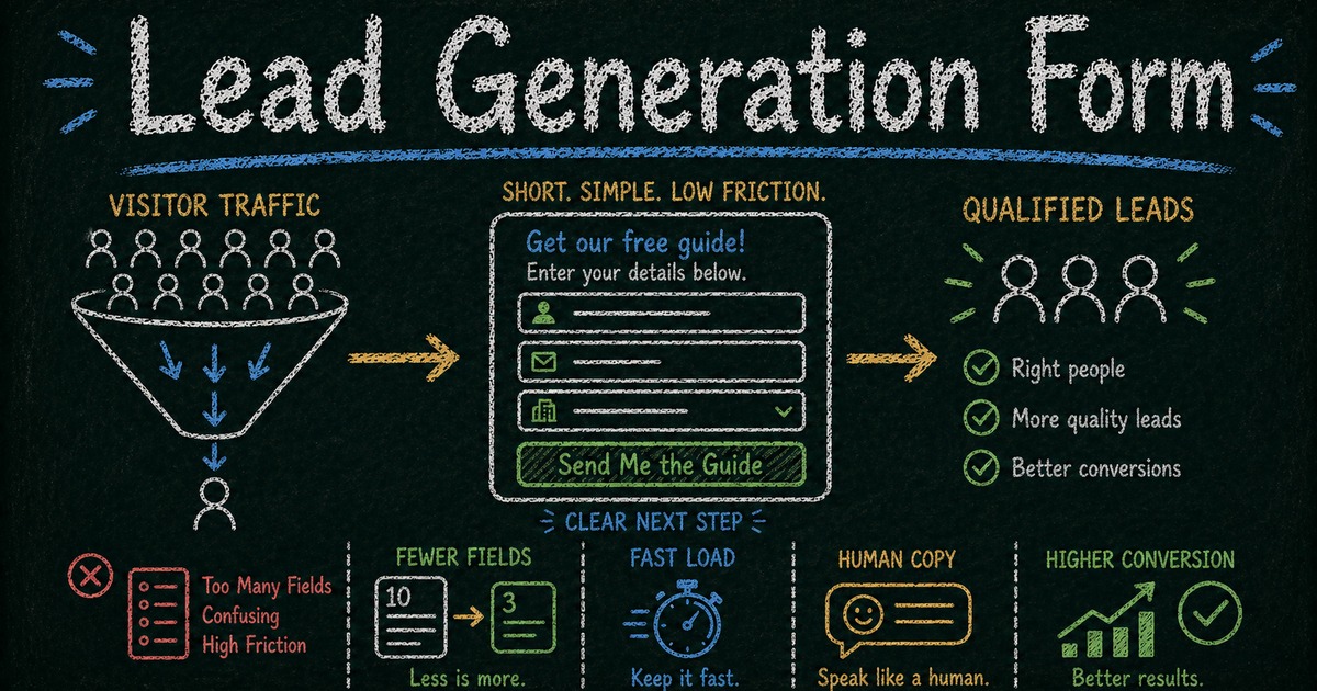
The biggest leak in your funnel isn’t your traffic. It isn’t your landing page copy. It’s your form.
Most lead gen forms lose 30–60% of potential conversions in the final step — the moment someone is ready to reach out and the form gets in the way. Too slow, too long, too many clicks, or too generic to feel like something worth trusting.
Your ads are running. Your landing page is live. Someone clicks through, reads the copy, decides you might be worth talking to.
Then they hit the form.
It takes three seconds to load. It has eight fields. It asks for a budget range, a job title, and a company size — things a sales team might want, but that this person hasn’t agreed to share yet. On mobile, the layout doesn’t quite work. There’s no confirmation after they submit. The page just goes blank.
They close the tab.
This is where most lead generation falls apart — not in the ad creative, not in the headline, but in the final ten seconds before someone becomes a lead. The form is the last conversion point, and most teams treat it as an afterthought.
A lead generation form is a web form that collects contact information — typically a name, email, and sometimes a phone number or company — from people who are actively interested in what you offer. Done right, it turns an interested visitor into a lead. Done wrong, it’s a polite way to send interested people elsewhere.
TL;DR — A lead generation form converts interested visitors into contacts by asking for the minimum information needed to continue the conversation.
- Reduce friction first — slow, long, generic forms waste the traffic you already paid for.
- Match field count to intent — newsletter forms need fewer fields than quote or demo requests.
- Make the next step explicit — confirmation copy and follow-up emails should tell leads what happens now.
- Works for: newsletter signup, demo request, quote request, waitlist, consultation inquiry, partner application.
- Treat the form as the final conversion point, not an afterthought below the landing page.
The five principles of a high-converting lead gen form
1. It has to look good
This sounds obvious and is consistently ignored.
When someone lands on your form, they make a judgment call in the first two seconds: does this feel trustworthy? A form that looks generic, dated, or thrown together signals that the company behind it doesn’t care much. And if the form doesn’t look cared for, why would someone hand over their contact information?
In our experience, the first thing users notice — before reading a single word — is whether the form looks like something built by a real company or something assembled in ten minutes. That snap judgment affects whether they keep reading.
Visual quality is a credibility signal. A clean, well-designed form with a clear cover image, thoughtful typography, and a coherent layout communicates professionalism before a single field is touched. That changes willingness to complete. FormHug forms are designed to look polished by default — not because aesthetics are a luxury, but because a good-looking form genuinely gets more submissions.
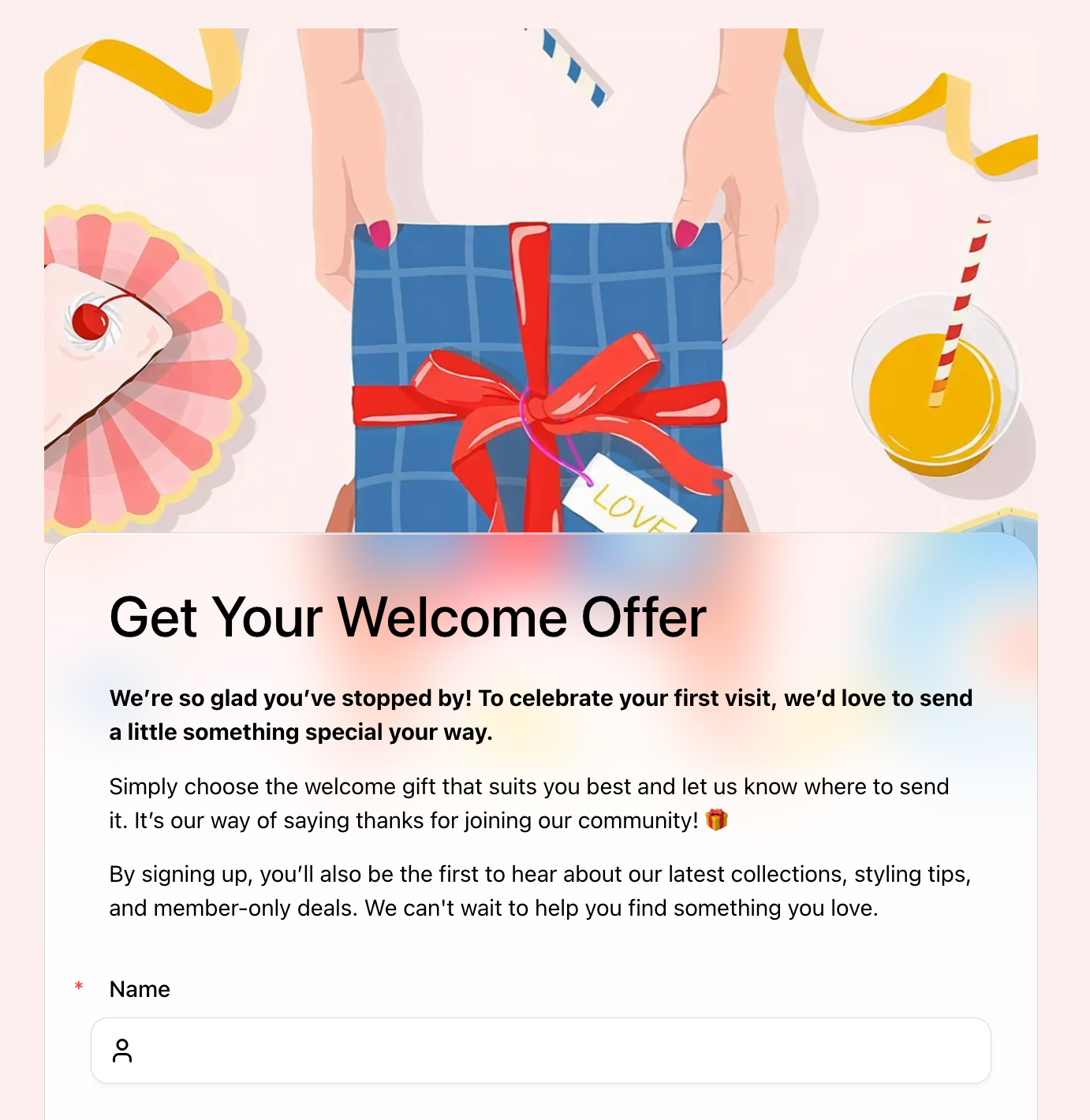 A well-designed lead gen form signals credibility before a single field is filled. The Welcome Offer Form uses a cover image and warm copy to set the right tone for first-time visitors.
2. It has to load fast
Every second of load time costs conversions. Research consistently shows that each additional second of load time reduces conversion rate significantly — and for forms specifically, the effect is worse, because the visitor has already made the decision to act. They’re waiting for the page to let them do something they’ve already decided to do.
A form that spins for three seconds will lose a meaningful share of people who were ready to fill it out. That loss won’t appear in your ad reports. It’ll just look like a traffic problem.
If your form lives on an embedded page, the surrounding stack affects load time. If it’s a standalone URL, the hosting and rendering pipeline matter. FormHug forms load as standalone pages on fast infrastructure — one reason completion rates tend to be higher than embedded form alternatives.
3. Ask only what you need right now
This is where most lead gen forms fail: they ask for everything at once.
Company size. Annual revenue. Current tool stack. Timeline to purchase. Preferred contact time.
These are sales qualification questions. They belong in a discovery call, not in a form that’s supposed to get someone into the funnel in the first place.
In most cases, each additional field after the third reduces completion meaningfully — especially on mobile, where typing is slower and patience is shorter. There’s a point where a form stops feeling like a quick step and starts feeling like homework.
At the lead capture stage, you need: name, email, and at most one qualifying question that helps you respond more usefully (“what are you trying to solve?” or “which service are you interested in?”). Everything else can wait until you’re having an actual conversation.
The exception: when your business needs specific information to deliver value — insurance quotes, property inquiries, investment consultations. In those cases, ask what’s required, but frame every question as being for the visitor’s benefit, not for your CRM.
4. One page, multiple fields — not one question per page
Multi-step forms look modern. They also quietly kill lead gen conversions.
At FormHug, we consistently see single-page forms outperform multi-step flows for lead generation — because they reduce the number of decisions from many to one. Each “next” click is a moment where someone can reconsider, get distracted, or simply close the tab. For lead gen, that cost accumulates fast.
A single-page form with five well-organized fields requires one decision: fill it out or don’t. A five-step form with the same five questions requires five decisions. The math isn’t complicated, but it’s easy to ignore because multi-step forms feel more sophisticated in product demos.
Keep your lead gen form on one page. Group related fields logically, use clear labels, and make the submit button visible without scrolling on most screens. Save multi-step flows for onboarding, applications, and surveys where depth is the point.
5. The tone has to feel human
Form copy is more important than it looks.
The difference between “First Name *” and “What should we call you?” is not just a style preference — it changes how the interaction feels. One is a bureaucratic transaction. The other is the start of a conversation. “Let’s talk” consistently converts better than “Submit.” “We’ll be in touch within one business day” is more reassuring than a blank confirmation screen.
Write your form header, field labels, placeholder text, and submit button as if you’re genuinely glad this person showed up. Because you are.
The form is often the first real interaction someone has with your product — not your homepage, not your ad. It sets the tone for everything that follows.
What most lead form guides don’t tell you
Most content about lead generation forms covers the same ground: fewer fields, clear CTAs, mobile-friendly layout. That’s all true. Here’s what doesn’t get said often enough.
Multi-step isn’t better — it’s just newer. The move to one-question-per-page forms was driven by UX trends in consumer apps, not by lead gen conversion data. For lead capture specifically, the additional clicks consistently hurt more than the perceived simplicity helps. The most effective lead forms still ask everything on one page with a clear visual hierarchy.
More data doesn’t mean better leads. Adding a “company revenue” or “team size” field to your form won’t improve lead quality — it’ll reduce volume without meaningfully improving the quality of who gets through. Real qualification happens in conversations, not fields. The role of the form is to get the conversation started.
Design impacts trust more than most marketers realize. A/B tests on form design consistently show that visual quality affects completion rate — not just because users find good-looking forms easier to use, but because design is a proxy for credibility. A form that looks like someone cared enough to make it look good signals that the company behind it cares about the experience. That matters at the moment someone is deciding whether to hand over their email address.
Two details most people overlook
Send a confirmation email after submission
The moment someone submits a form, they have one quiet question: did that actually work?
A confirmation email answers it. It arrives within seconds, confirms the submission was received, and sets an expectation for what happens next. It also signals that there’s a real team behind the form — not just a data-collection endpoint that goes nowhere.
At FormHug, we’ve seen this detail make a measurable difference for higher-intent forms. For visitors who weren’t entirely sure they wanted to submit, a well-written confirmation email is the first moment they feel good about the decision. It’s the start of the relationship, not a formality.
FormHug’s notification settings let you configure an automatic email that goes to the respondent the moment they submit, using the email address they provided in the form. You can write a real subject line, a real message, and include whatever’s relevant — your typical response time, next steps, a link to something useful. It takes a few minutes to set up and is one of the most underused features in any form builder.
The floating Contact Us button
Here’s something that happens more than you’d expect: someone is partway through your form and they have a question. Maybe they’re not sure which option fits their situation. Maybe they want to confirm something before sharing their email. So they stop, open a new tab, try to find your contact page, either find it or don’t — and either way, they’ve broken their momentum.
FormHug forms include a floating Contact Us button that stays visible as the respondent works through the form. If they have a question at any point, they can tap it to call or email directly — without leaving the form. Once their question is answered, they can pick up exactly where they left off.
For high-intent forms — inquiry forms, quote requests, consultation requests, anything where the visitor is making a considered decision — this kind of in-context support reduces the hesitation that causes drop-off. Most form builders don’t offer this at all.
Choose the right form for your goal
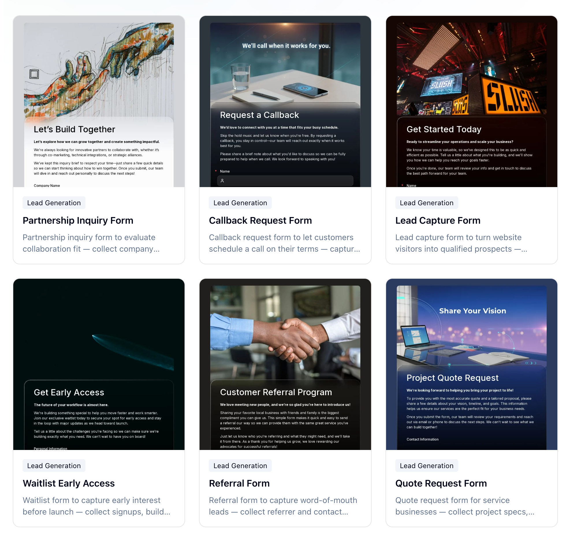 FormHug’s lead generation template library — 21 templates covering every stage of the funnel, from low-barrier signups to high-intent sales inquiries.
Not all lead generation forms serve the same purpose. A newsletter signup should feel frictionless. A demo request can ask more, because you’re offering more in return. Instead of starting from scratch, match your form type to your goal — and use a proven template.
Low-barrier capture: growing a list or pipeline
These forms are designed for volume. The goal is to get someone into your funnel with as little friction as possible. Keep fields to a minimum, make the CTA specific, and let the value proposition do the qualifying.
- Newsletter Signup Form — name and email, nothing else. Best for content-driven products and brands with a regular publishing cadence.
- Early Access Form — for pre-launch products. Capture genuine interest before you have something to ship. → Try this template
- Waitlist Early Access Form — build a waitlist with a sense of momentum. Best when access is genuinely limited. → Try this template
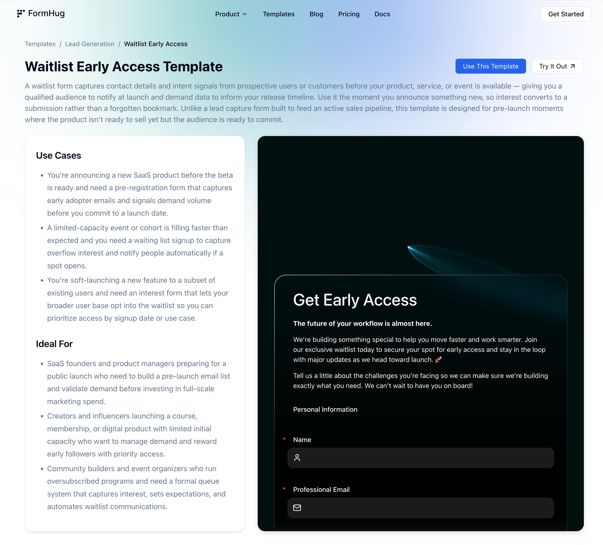 Each FormHug template includes a full description, use cases, and a live preview — so you can see exactly what respondents will experience before publishing.
- Free Trial Signup Form — for SaaS products. Name, email, company. Save the qualification for onboarding. → Try this template
- Giveaway Entry Form — high-volume capture with the prize doing the conversion work. → Try this template
- Welcome Offer Form — convert first-time visitors with a discount or gift in exchange for their email. Best for e-commerce and early-stage brands. → Try this template
Sales pipeline: intent-based leads
These forms are for visitors who are ready to have a real conversation. They’ve moved past general interest — they want a quote, a demo, or a callback. You can ask more questions here because you’re providing something substantive in return.
- Lead Capture Form — a flexible form for turning website visitors into qualified prospects. Best paired with a strong offer or CTA on your landing page. → Try this template
- Request a Demo Form — for B2B SaaS. Collect company size, use case, and availability so your sales team arrives prepared. → Try this template
- Get a Quote Form — for agencies and contractors. Collect project scope, timeline, and budget to send a tailored proposal. → Try this template
- Quote Request Form — optimized for service businesses where project specs determine pricing. → Try this template
- Consultation Request Form — for coaches, consultants, advisors, and legal professionals. → Try this template
- Callback Request Form — let prospects choose when they want to be contacted. Works well on pricing pages. → Try this template
Industry-specific inquiry forms
Some leads require specific context to move forward — not because you want more data, but because you genuinely can’t respond usefully without it.
- Insurance Quote Form — collect coverage type and basic risk information. → Try this template
- Investment Inquiry Form — capture investor goals and risk profile for financial advisory intake. → Try this template
- Property Inquiry Form — buyer and renter leads with location, property type, and budget. → Try this template
- Event Inquiry Form — venue leads with event type, date, and guest count. → Try this template
Growth and partnership forms
These forms grow your network rather than your sales pipeline. The leads here are partners, advocates, and collaborators.
- Referral Form — let customers refer contacts with a simple, shareable form. → Try this template
- Employee Referral Form — structured candidate referrals for HR teams. → Try this template
- Affiliate Application Form — recruit and screen affiliate partners. → Try this template
- Partnership Inquiry Form — evaluate collaboration fit for co-marketing and strategic alliances. → Try this template
- Contact Us Form — a general-purpose entry point for any visitor who wants to reach you. → Try this template
Browse all 21 templates on the FormHug lead generation templates page.
Three mistakes that quietly kill completion rates
Asking for too much too soon. Budget ranges, company revenue, full address — these fields feel reasonable from an internal process perspective and create real friction for the person filling out the form. A visitor who just decided to reach out hasn’t agreed to a screening process. Ask the minimum that lets you give a useful response. Qualify the rest in the conversation that follows.
No post-submit feedback. If a form clears on submit with no confirmation message, no redirect, and no email — the visitor has no way to know if anything happened. Some will submit again, generating duplicates. Most will assume something broke. A visible confirmation message is the baseline. An automatic confirmation email is better, and takes less than five minutes to set up.
Tested on desktop only. A form that looks clean in a browser window can be genuinely broken on a phone — fields too small to tap accurately, the submit button below the fold, labels that overlap on a narrow screen. Test your form on an actual mobile device before it goes live. The share of leads coming from mobile is high enough that a broken mobile experience isn’t a minor issue.
Frequently Asked Questions
What is the best lead generation form builder?
The best lead gen form builder is one that makes forms fast to load, easy to fill out on mobile, and straightforward to customize without writing code. FormHug is built specifically for this: forms look polished by default, load as fast standalone pages, support custom confirmation emails, and include features like a floating contact button that most builders don’t offer. Compared to tools like Typeform or Fillout, FormHug is designed to maximize completion rates rather than just collect data — which matters most for lead generation. See how it compares →
What fields should a lead generation form have?
At minimum: name and email. For most top-of-funnel lead capture, that’s all you need at first contact. Add a phone number if phone follow-up is part of your process. Add one qualifying question — “what are you trying to solve?” or “which service are you interested in?” — if it meaningfully helps your team respond better. Skip everything else until you’re in an actual conversation.
How many fields is too many?
For a top-of-funnel lead capture form, more than five fields starts to hurt. For intent-based forms — demo requests, quote requests, consultation requests — more fields are acceptable because the visitor expects to provide context in exchange for a specific response. The question to ask about every field: is knowing this worth the risk of losing the submission? If the answer isn’t clearly yes, cut it.
Should I use a multi-step form or a single-page form for lead gen?
For lead generation, a single-page form typically converts better than a multi-step form with the same fields. Each “next” click is a decision point where someone can drop off. If your form genuinely requires more than six or seven fields, a two-step approach — basic contact info first, qualifying questions second — can work. Keep steps to a minimum.
What should the submit button say?
Not “Submit.” Something that names what’s about to happen: “Get My Free Quote,” “Book My Demo,” “Join the Waitlist,” “Send My Inquiry.” A specific, action-oriented label consistently converts better than a generic one.
How do I reduce spam on a lead gen form?
A required free-text field (“what’s your biggest challenge right now?”) filters out a large share of generic bot submissions, since most bots skip open-ended fields. You can also enable reCAPTCHA if your form builder supports it. Well-designed forms on legitimate landing pages typically see low spam rates without aggressive filtering.
How do I follow up with leads automatically?
Start with the confirmation email — FormHug’s notification settings let you send an automatic email to the respondent the moment they submit. For downstream automation, connect your form to your CRM or email tool via a webhook or native integration, so leads flow directly into your pipeline without manual export.
What makes a lead gen form look trustworthy?
Visual quality, fast load time, and human copy. A form that looks professionally designed, loads immediately, uses real language (not form-speak), and shows a real company name or logo reads as legitimate. Small additions — a privacy note below the email field, a specific CTA, a confirmation email that arrives quickly — reinforce that there’s a real team on the other side.
Related
- Best AI Form Builders in 2026 — how FormHug compares to Typeform, Fillout, and other form tools for lead generation
- How to Create an Online Booking Form — for service businesses that want to go from inquiry to scheduled appointment
- How to Create an Intake Form That Collects the Right Information — pair your lead form with an intake form to qualify clients before the first session
A lead form isn’t just a form; it’s the final ten seconds where interest either becomes action or disappears. Get this part right, and everything before it works better. Build your first lead generation form →

Written by
FormHug TeamProduct, research, and form automation team
The FormHug Team brings together product builders, workflow researchers, and form automation practitioners who study how people collect, route, and act on information online. Our guides are based on hands-on product testing, template analysis, customer workflow patterns, and deep experience with forms, surveys, quizzes, AI-assisted creation, integrations, and results sharing.