How to Create a Multi-Step Form That Reduces Drop-Off
Build the form
Create the workflow with AI
Start from a prompt, a template, or a blank form and publish a polished FormHug workflow.
Long forms do not fail only because they are long. They fail because they feel long before the respondent understands why the questions matter. A 20-field form can work when it feels organized; a 7-field form can fail when it feels like a wall.
A multi-step form solves that perception problem by breaking the request into meaningful stages. The goal is not to hide the work. The goal is to make the work feel ordered, relevant, and worth finishing.
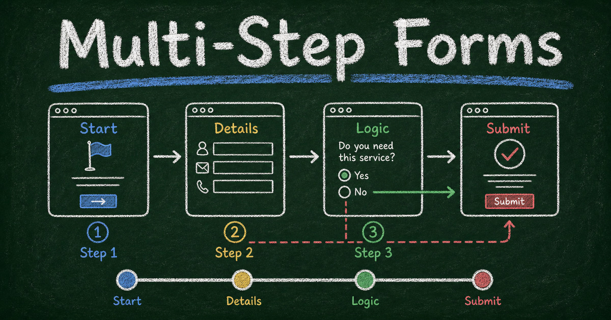
This guide explains how to create a multi-step form that reduces drop-off, how it differs from a one-question-at-a-time card layout, and how to build one in FormHug with Page Break fields.
TL;DR - A multi-step form breaks one long form into several short pages so respondents move through the workflow in logical stages.
- Group by decision stage - identity, fit, details, review, and payment should not feel like one pile.
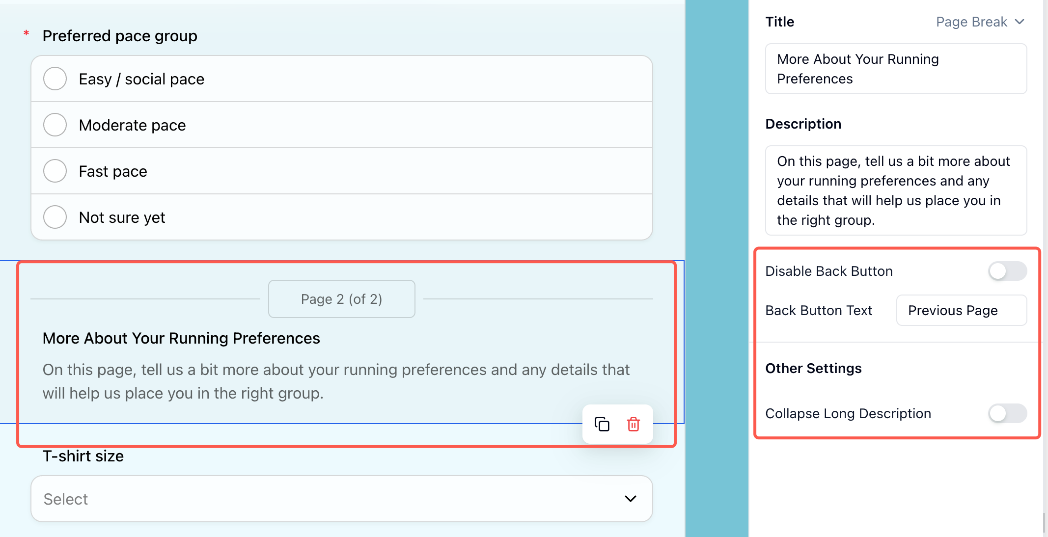
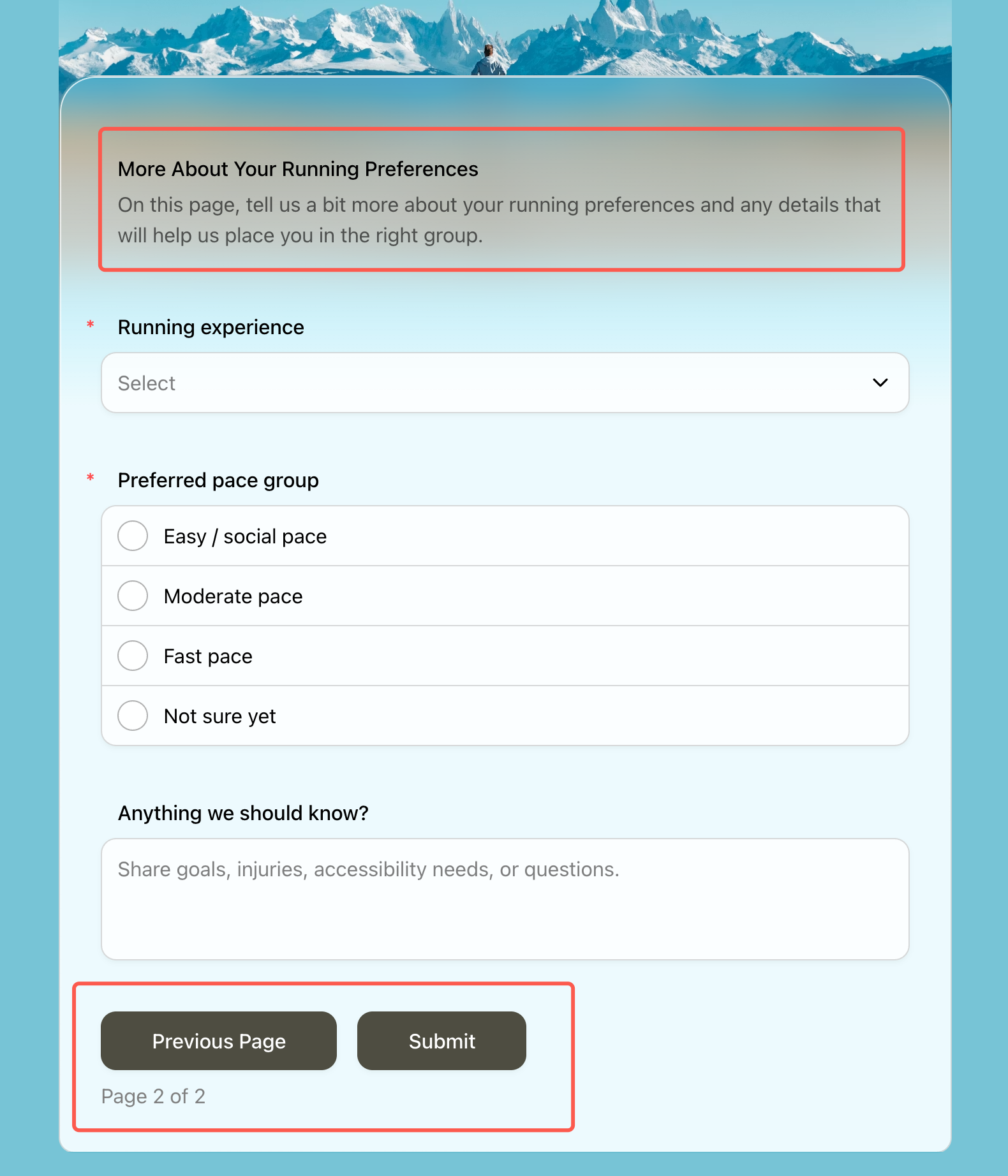
- Use Page Break fields in FormHug - Page Break separates one form into multiple pages without turning every field into a separate card.
- Show progress early - people tolerate effort better when they can see the path.
- Use logic to skip irrelevant pages - shorter personal paths beat one universal form.
- Works for: applications, intake forms, registrations, bookings, payments, assessments, and lead qualification.
- FormHug can create structured forms with sections, conditional logic, and workflow-specific fields.
Try the Live Multi-Step Form
Before reading the design rules, try a working version. This demo uses Page Break fields to separate the form into stages, so the respondent moves through a sequence rather than facing one long page.
Open the multi-step form demo in a new tab ->
What Is a Multi-Step Form?
A multi-step form is an online form split into multiple pages, screens, or sections. Instead of showing every field at once, it guides respondents through a sequence: basic information, qualifying questions, details, review, and submission.
Multi-step forms are useful when the form has more than one mental job. A scholarship application asks for identity, eligibility, academic details, essay responses, and document uploads. A client intake form asks for contact details, problem context, budget, timeline, and consent. Those are not one task; they are a workflow.
For shorter forms, a single page may be better. If the form has only 3 to 6 fields, splitting it into steps can add friction. For longer workflows, the structure helps respondents understand where they are. For more on form length, see how many questions should a survey have; the same fatigue principle applies to forms.
Multi-Step Form vs One-Question Card Layout
A multi-step form is not the same as a one-question-at-a-time card layout.
| Pattern | What it does | Best for |
|---|---|---|
| Multi-step form | groups several related fields onto separate pages | applications, intake forms, registrations, payments |
| One-question card layout | shows one question per screen or card | quizzes, lightweight surveys, conversational flows |
| Single-page form | shows all fields in one continuous page | short contact forms, simple requests |
The distinction matters because “multi-step” is about workflow structure, not just visual style. A scholarship application might have one page for eligibility, one for applicant details, one for essay and documents, and one for review. Each page can contain several fields.
In FormHug, you create that structure with the Page Break display field. Add a Page Break where one stage should end and the next should begin. The full field reference is in the Page Break documentation.
The Step Architecture Framework
Use the Step Architecture Framework to decide how many pages you need:
| Step | Job | Example fields |
|---|---|---|
| Start | confirm relevance | role, use case, eligibility |
| Identity | know who is submitting | name, email, organization |
| Detail | collect the core information | request, answers, preferences |
| Proof | collect files, payment, or consent | upload, signature, payment |
| Review | reduce mistakes | summary, confirmation |
Most multi-step forms should have 3 to 5 steps. More than 6 steps can feel like a process maze unless the task is naturally complex, such as a long application.
The best first step is not always “name and email.” For lead generation, start with the problem or goal. For applications, start with eligibility. For bookings, start with service type and date. Ask for identity once the respondent understands the value of continuing.
When Multi-Step Forms Reduce Drop-Off
Multi-step forms help when they reduce cognitive load.
Use them when:
- The form has more than 10 to 12 fields
- Questions belong to clear categories
- Some respondents should skip entire sections
- Later questions require more effort than early questions
- The form includes uploads, payment, or consent
- The respondent needs confidence before sharing personal information
For example, a real estate lead capture form can start with “Are you buying, selling, or both?” That first answer changes the rest of the form. A patient intake form can group medical history separately from appointment preferences, making the form feel more professional and less overwhelming.
When Multi-Step Forms Hurt
Do not split a form just because the UI looks cleaner. Multi-step forms can hurt when each step has too little substance or when respondents cannot tell how much is left.
Avoid multi-step forms when:
- The form has fewer than 6 fields
- People need to compare all questions at once
- The first step asks for personal information with no context
- There is no progress indicator
- The user may need to edit previous answers frequently
- The form is embedded in a tiny space where page transitions feel slow
The rule is simple: a step should reduce mental effort, not merely move fields offscreen.
How to Design Better Form Steps
Start with the easiest meaningful question
The first question should feel easy and relevant. It can be a use case, category, date, or goal. This creates momentum before asking for sensitive or high-effort information.
Put high-effort fields later
File uploads, long text responses, payment, and detailed explanations belong after the respondent has committed to the process. That does not mean hiding surprises. If payment or uploads are required, say so early, then collect them later.
Name each step clearly
Use labels that explain the job:
- Your details
- Eligibility
- Project goals
- Schedule
- Payment
- Review
Avoid vague labels like “Step 2” without context.
Use conditional logic
Conditional logic is the strongest reason to use multi-step structure. If someone is not eligible, show a polite ending. If they choose “business buyer,” show business questions. If they choose “student,” show student questions.
For the full logic pattern, read conditional logic forms.
How FormHug Compares for Multi-Step Workflows
| Need | FormHug | Basic single-page form |
|---|---|---|
| AI draft from a workflow description | Yes | Usually no |
| Page Break fields for multi-page structure | Yes | Sometimes |
| Sections and grouped fields | Yes | Sometimes |
| Conditional paths | Yes | Often limited |
| Payments, bookings, quizzes, and applications | Yes | Usually separate tools |
| Public sharing and QR-friendly forms | Yes | Varies |
For simple contact forms, any form builder can work. For applications, registrations, payments, and intake flows, a multi-step structure gives the form a shape that matches the respondent’s decision process.
How to Create a Multi-Step Form in FormHug
Step 1: Describe the workflow
Start with the outcome:
Create a multi-step scholarship application form with eligibility, applicant details, academic background, essay questions, document upload, and final confirmation.
FormHug AI can create the first structure so you are editing a workflow instead of staring at a blank form.
Step 2: Group fields by mental task
Move related fields together. Keep contact details separate from long answers. Keep payment separate from preferences. Keep review or consent at the end.
Then add a Page Break between those groups. In FormHug, Page Break is a display field: it does not collect an answer by itself, but it changes how the public form is divided into pages.
Step 3: Add conditional paths
Use logic to skip irrelevant sections. If a respondent is not eligible, route them to a short explanation. If they choose a paid option, show payment fields. If they choose “other,” show one follow-up.
Step 4: Test the shortest and longest paths
Preview the form as different respondents. In our testing, the biggest multi-step mistakes show up only when you test the “no” path, the “other” path, and the payment or upload path.
Frequently Asked Questions
How do you make a form with multiple pages?
Group related fields into steps, then add Page Break fields between those groups. In FormHug, Page Break is the field that turns one form into multiple pages.
Do multi-step forms increase completion rates?
They can, especially for longer workflows, but only when the steps reduce mental effort. Splitting a short form into unnecessary pages can increase drop-off.
How many steps should a multi-step form have?
Most multi-step forms should have 3 to 5 steps. Use fewer for simple workflows and more only when the task naturally requires separate sections, such as applications or intake forms.
What should the first step of a form ask?
Ask the easiest meaningful question: use case, eligibility, category, date, or goal. Avoid asking for sensitive personal details before the respondent understands why the form is worth completing.
Should payment be on the last step?
Usually yes. Explain early that payment is required, then collect payment after the respondent has chosen the product, service, ticket, or membership option.
Can I use conditional logic in a multi-step form?
Yes. Conditional logic is one of the best reasons to use a multi-step form because it lets each respondent see only the pages and questions that apply.
Can FormHug create multi-step forms?
Yes. FormHug can generate structured forms from a prompt, group fields into sections, add Page Break display fields, support conditional logic, and handle workflows such as registrations, applications, bookings, quizzes, and payments.
Related
- Conditional Logic Forms - show the right questions to the right respondents
- How to Create an Intake Form - collect detailed information without overwhelming people
- How to Create an Online Application Form - structure longer application workflows
- How to Create a Payment Form - add payment at the right moment in the flow
A long form does not have to feel like a wall. Give the workflow a shape, show progress, and make every step earn the next click. Create your form →

Written by
FormHug TeamProduct, research, and form automation team
The FormHug Team brings together product builders, workflow researchers, and form automation practitioners who study how people collect, route, and act on information online. Our guides are based on hands-on product testing, template analysis, customer workflow patterns, and deep experience with forms, surveys, quizzes, AI-assisted creation, integrations, and results sharing.