

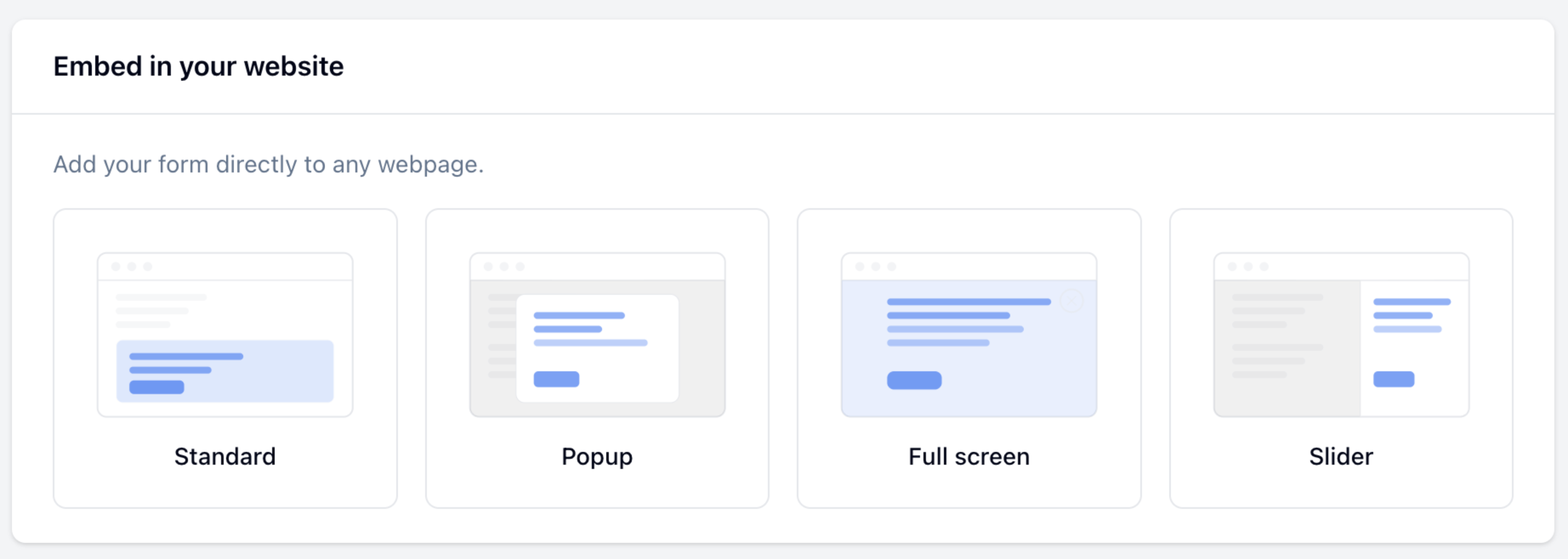
Getting the Embed Code
1
Publish your form
Click Publish in the top-right corner of the form editor.
2
Open the embed dialog
Click Share, then select Add to website.
3
Choose an embed type
Select Standard, Popup, Full screen, or Slider from the Embed type dropdown.
4
Configure options
Set button text, color, size, and position as needed — the preview panel updates in real time. Toggle between Desktop and Mobile to check both layouts.
5
Get the code
Click Get the code and paste the generated
<script> tag into your webpage.Standard
Embeds the form inline at the exact position where you place the code. The form is always visible as part of the page — no trigger needed.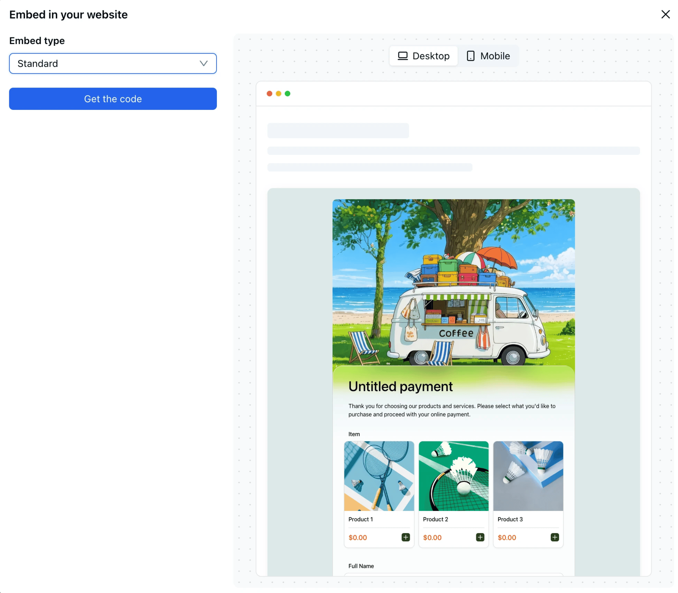
height query parameter controls how tall the embedded form appears on the page. Adjust it to match your form’s length — short forms typically need 400–500px; longer forms need 700px or more.
Popup
Opens the form in a centered overlay when triggered. By default a floating button appears on the page; turn it off to use your own element as the trigger.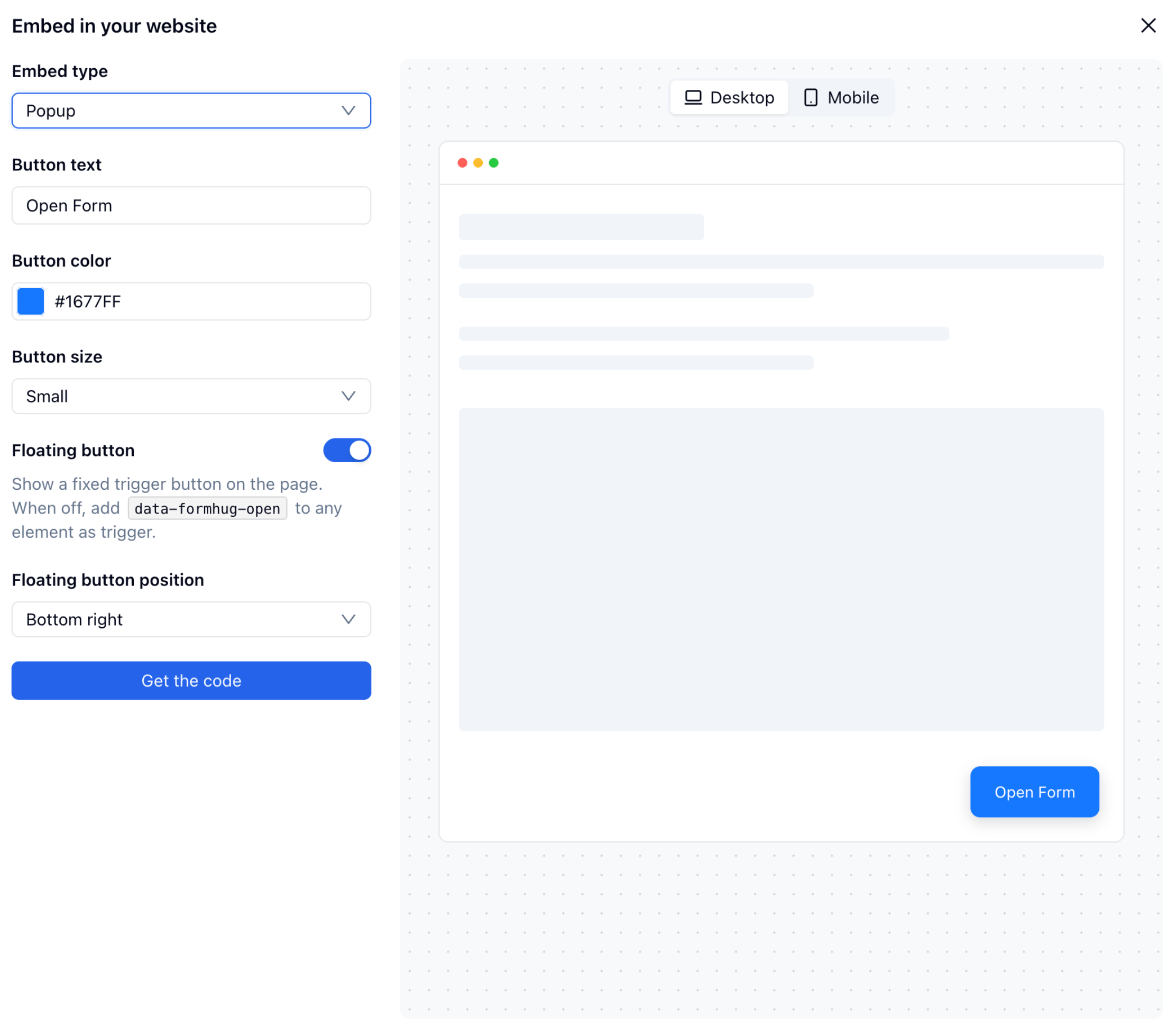
When
data-formhug-floating="false", add data-formhug-open to any element on your page to use it as the trigger — for example: <button data-formhug-open>Contact us</button>.Full Screen
Opens the form as a full-viewport overlay, covering the entire page. Configuration attributes are the same as Popup.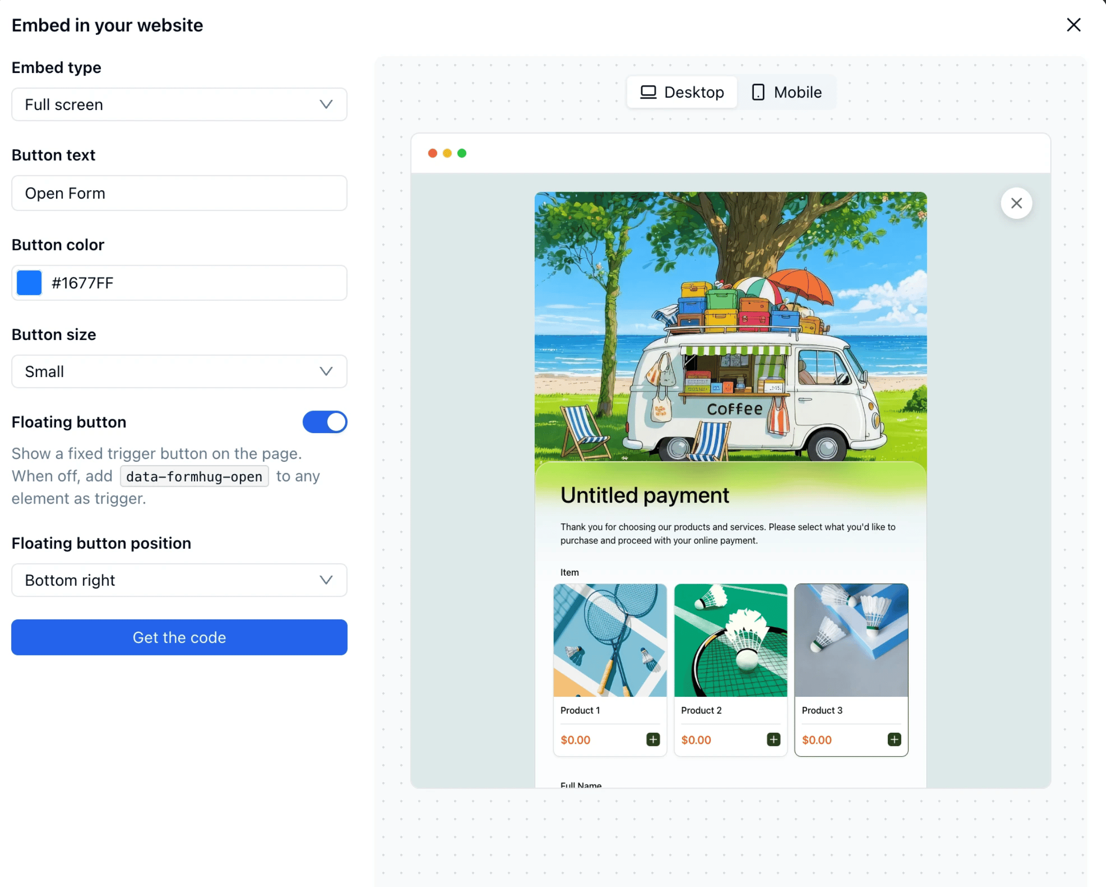
Slider
Slides the form in from the left or right edge of the page. Useful for keeping the page content visible while the form is open.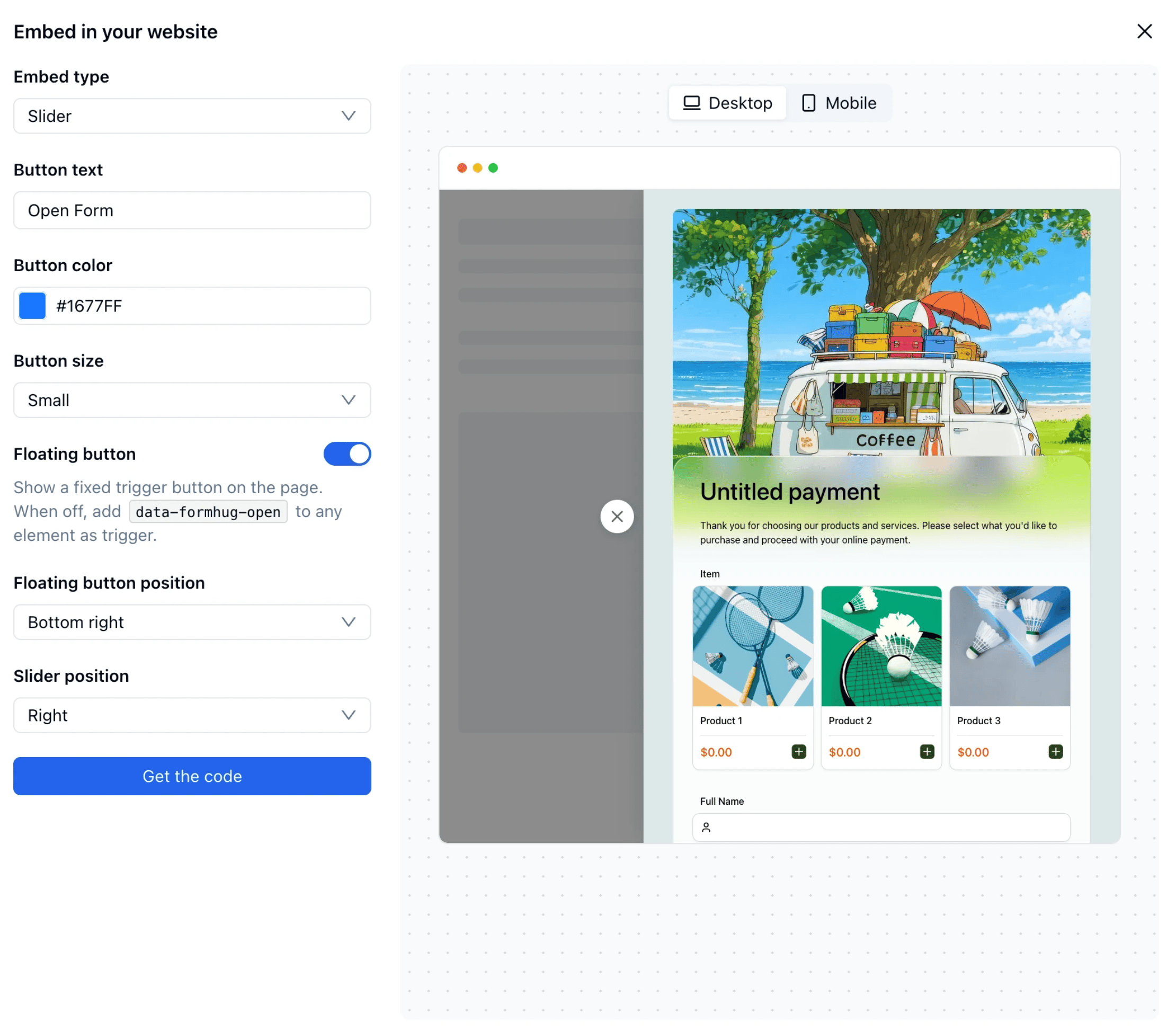
Platform Guides
WordPress
Embed in WordPress
Webflow
Embed in Webflow
Notion
Embed in Notion
Framer
Embed in Framer
Related
Share Link
All sharing options including QR code, social, and AI poster
Lead Generation Guide
Learn how to structure and place forms that capture qualified leads